

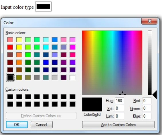
Input Color Type
<input type="color" name="mycolor" />
Input Date Type
<input type="date" name="mydate" />

Input Type: datetime-local
This type is picking the date from a PopupCalender and time by arrow keys in control or you can type both in.
<input type="datetime-local" name="mydateTimeLocal"/>

Input month type
This type is used for picking the month and year from the PopupCalender.
<input type="month" name="mymonth"/>

Input number type
This type is used for an input field that will contain only numeric values.
You can also set the min and max value in this type.
<input type="number" name="mynumber" min="1" max="5"/>

Input RANGE type
It’s a Slider control, if you don’t want to type it in then you can select the value via the slider. You need to give the min and max values of this type.
<input type="range" name="myrange" min="1" max="5"/>

Input Time type
This type is used for selecting the time by the user.
<input type="time" name="mytime" />

Input Week type
This type is used for selecting the week of a specific year.
<input type="week" name="myweek" />

Bind Datalist with input Tag in place of the select tag
Bind a list of data with an input tag without using the select tag.
- <input list="browsers"/>
- <datalist id="browsers">
- <option value="C"/>
- <option value="C++"/>
- <option value="C#"/>
- <option value="JAVA"/>
- <option value="PHP"/>
- </datalist>

Note: All types of INPUT Tags are the basis on browsers, Google Chrome supports most of them.
Rahul BansalPosted Jan 22, 2014, 12:30 AM
Thanks Dinesh
Dinesh BeniwalPosted Jan 21, 2014, 5:34 AM
Good start Rahul, Welcome to the C# Corner.